
Quick Guide
Configure Dashboards in Suger Console
-
Enable and Configure Analytics
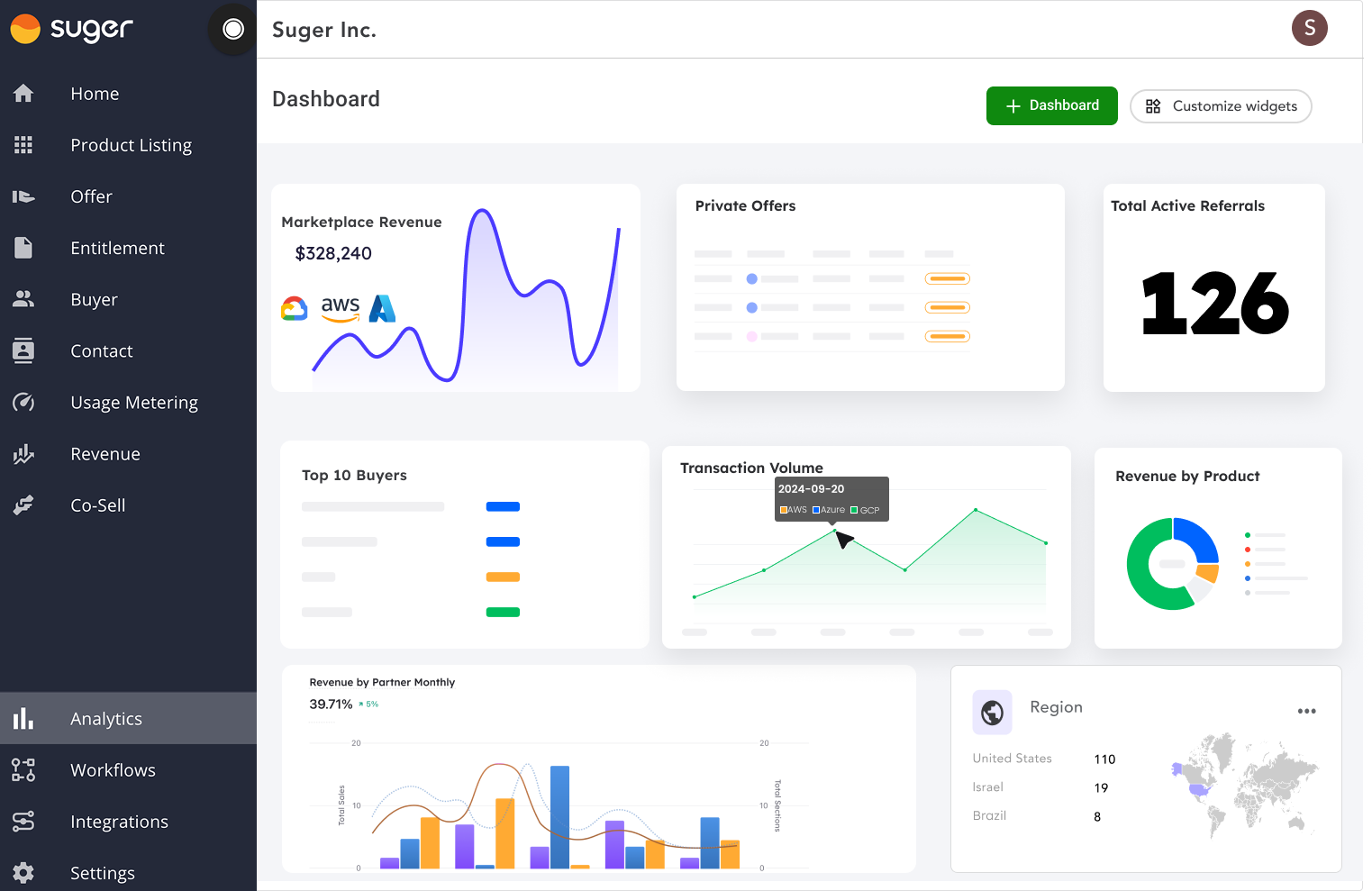
To start using analytics, visit Suger Console. Suger provides several built-in dashboards out of the box, and you can choose from these or create your own customized dashboards.
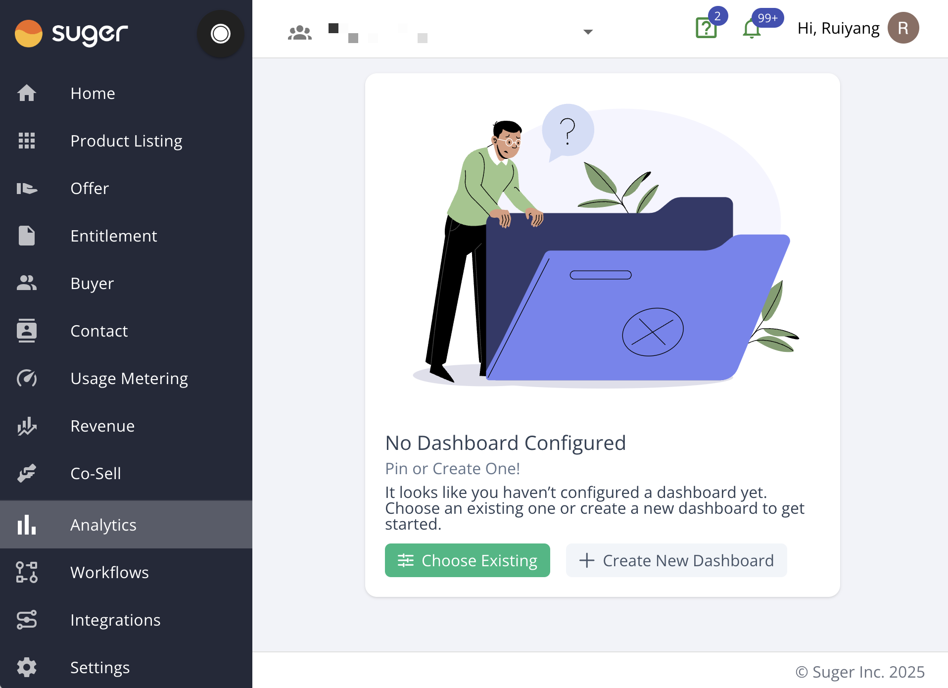
-
Create New Dashboards
To create a custom dashboard, click the “New Dashboard” button and configure it according to your needs. You can add various widgets, charts, and data visualizations.
-
Exploring Dashboards
Once your dashboards are configured, you’ll find them pinned at the top of the console. Click on a dashboard name to switch between different dashboards and explore them further.
Filters
Suger provides two types of filters to help you refine the data shown on your dashboards:
-
Static Filters: These filters are typically placed at the top of the dashboard and are authored by the dashboard designer. They are usually required for viewing certain data, ensuring that users can filter by essential parameters like date range, region, or specific partners.
-
Interactive Filters: These filters allow users to click directly on parts of the charts (such as sections of a pie chart or data points on a bar chart) to dynamically apply filters. For example, clicking on “AWS” in a “Revenue by Partners” pie chart applies a dynamic filter of
partner=AWSto all related charts on the dashboard.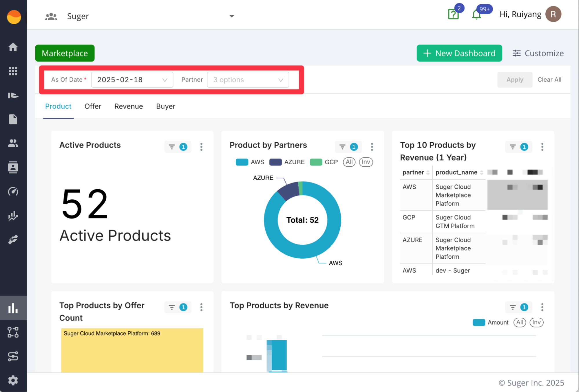
Common Filters
-
As Of Date: This filter snapshots your data at a specific point in time, allowing you to compare dashboards and reports across different dates. You can set the “As Of Date” to view historical data, providing consistency across time periods.
-
Partners: Filter data by cloud partners, such as AWS, GCP, or Azure, to narrow down insights by specific partners.
View as Table
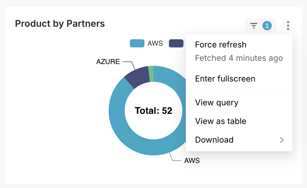
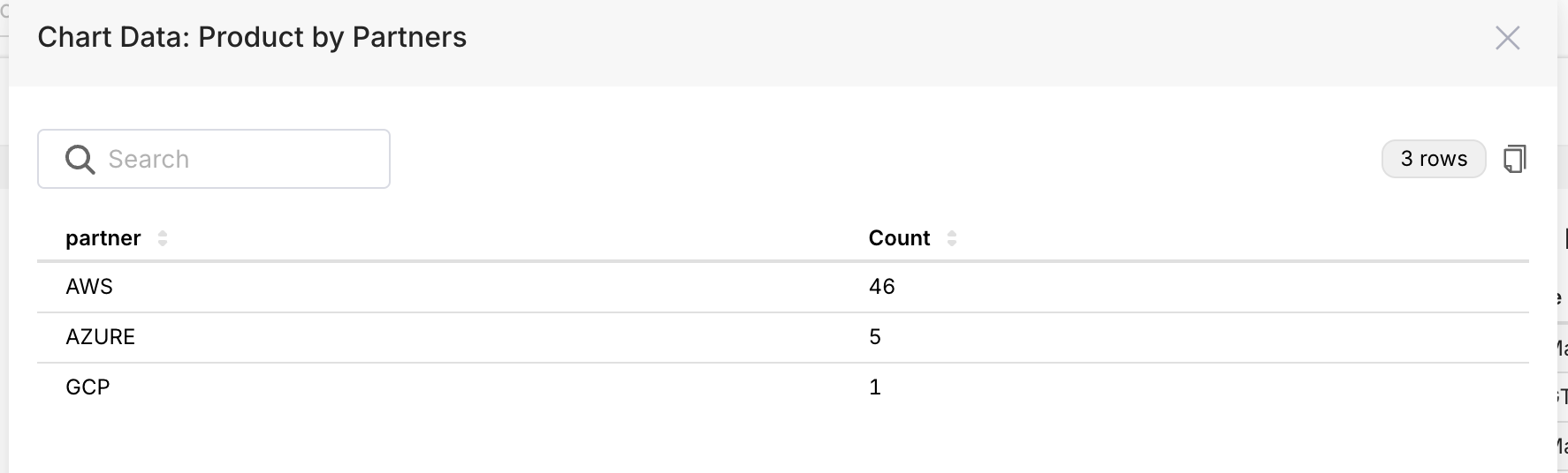
All charts within the dashboard can be viewed as tables, providing a detailed, raw data view behind the visualizations. This option is useful for users who want to analyze data at a granular level, such as verifying numbers or conducting deeper analysis beyond the chart.
Export and Download
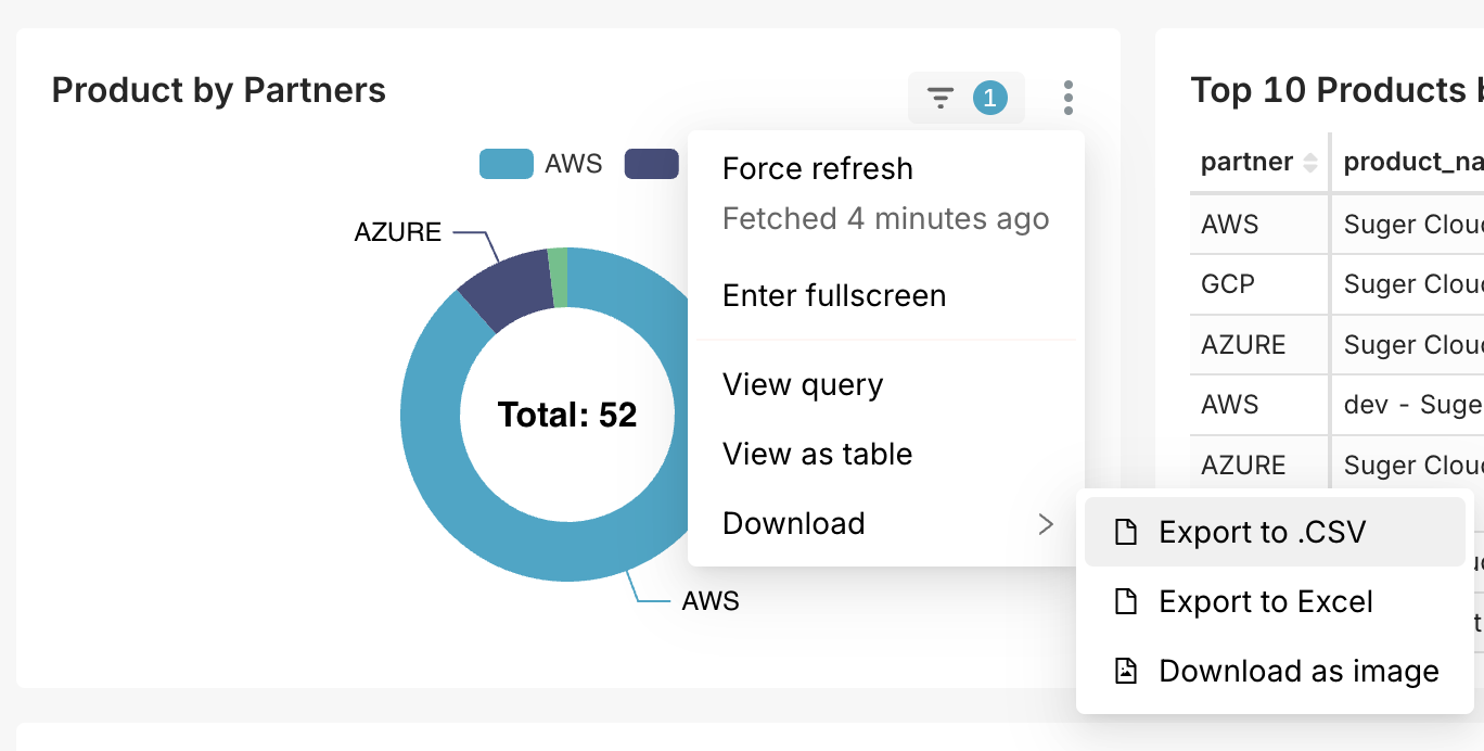
Suger allows you to download data and visualizations in various formats:
-
Export to CSV or Excel: You can export chart data to CSV or Excel for further analysis or reporting.
-
Download Chart Images: If you need to share or present charts, you can download them as images to include in reports, presentations, or other documents.
Spotted something wrong or out of date on this page? Tell us and we'll correct it.