
Customize the Partner Portal Overview
Branding changes how your partner portal looks. Partner Views changes what’s actually on it — which cards a partner lands on, in what order, and what you have to say to them. And because the other side can do the same to you, it also changes what you land on.
Overview
By default every partner opens their portal Overview onto the same standard set of cards. Partner Views lets you replace that with a layout you design: reorder the built-in cards, hide the ones that don’t apply, and add your own content — a welcome note, a price list, a gallery of assets.
It has two halves:
- Content — a library of reusable content you author once: rich text, tables, and media galleries.
- Templates — reusable Overview layouts. Each template is a grid of blocks; a block is either a built-in Suger card or a pointer at one of your content items.
You then apply a template to specific partners.
The arrangement is symmetrical, which is easy to miss. A template you author and assign is your outbound view — what that partner sees from you. When the partner is a Suger organization running their own program, they can assign you one too, and that inbound template is what you see: opening a partner record lands on their layout for you, resolved from their library, and Preview as {partner} is the button that flips to your outbound side. If the partner has customized nothing, the inbound view falls back to the standard Overview cards, drawn with your real relationship data.
Find Partner Views
- Go to Suger Console, then Settings.
- Click Partner, then Partner Views.
- Use the Content and Templates sub-tabs.
Step 1 — Author Your Content
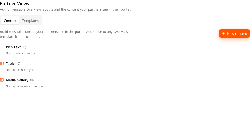
The Content tab holds the material your blocks will point at. Click New content and pick a kind:
| Kind | Use it for |
|---|---|
| Rich Text | A welcome message, program rules, an announcement. Formatted in a WYSIWYG editor. |
| Table | Price lists, contact directories, SLA tiers — anything with columns and rows you type yourself. |
| Media Gallery | Logos, screenshots, and other assets. Upload each image, give it a caption, and choose a Tile or Waterfall layout and how many show per page. PNG, JPG and GIF only. |
Each item gets a Name — that name is the heading a partner sees above the block — and its own content editor. Content is grouped on the page by kind, with a count and the date each item was last updated.
Step 2 — Build a Template
On the Templates tab, each template card shows its name, a Default badge if it’s the org default, how many partners use it, and how many blocks it holds. Click New template to start from the standard layout, or the copy icon on an existing one to clone it.
Edit opens a full-page editor.
The canvas
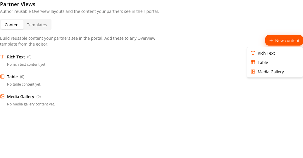
The toolbar carries the template name, a Columns control set to 1, 2, or 4, a Preview toggle, Discard, and Publish. Your layout changes aren’t saved until you click Publish — Discard drops them and returns to the list.
The left panel is the component palette, in two groups. Drag an item onto the canvas to add it.
Built-in cards draw live Suger data about the partnership — the editor shows sample data in their place:
| Block | Shows |
|---|---|
| Commissions | What each side owes the other. |
| At a Glance | Headline relationship metrics. |
| Partner Overview (AI) | An AI-written summary of the partner. |
| Revenue by Channel | Revenue split across marketplace channels. |
| Deals Over Time | Deal volume trend. |
| Activity & Engagement | A strip of relationship facts — Partnership Since, Last Active, website, employees, founded, cloud tier. Figures, not a feed of events. |
| CPPO Activity | Private-offer activity. |
| Co-Sell | Shared opportunities. |
| Tasks | Open action items. |
Content (CMS) blocks pull from your library: Rich Text, Table, and Media Gallery.
A built-in card can only be added once — it greys out and reads “added” in the palette after that. Content blocks can be added as many times as you like, each pointing at a different library item.
Working with blocks
Hover a block for its toolbar — a row of unlabelled icon buttons. Hover each one for its tooltip:
- Drag to reorder (the grip). You can also drag the block itself. Blocks reflow sideways within a row and vertically across rows.
- Make full width / Make standard width (the rectangle) toggles the block between standard width and spanning the whole row. Only present on a 2- or 4-column canvas.
- Hide from partners / Show to partners (the eye) keeps the block in the template but drops it from what partners see.
- Remove (the bin) takes it out entirely.
On a content block, a dropdown in its header picks which library item fills it, and Manage takes you to Partner Views in Settings to edit the library.
Preview swaps the editor for the partner’s view of the page — banner, section nav, and sidebar included — with hidden blocks dropped. Then click Publish. Publishing a template updates it for every partner already linked to it.
Step 3 — Apply the Template to Partners
Templates are assigned per partner. There are two ways in:
From Settings. On the template’s card, click Apply to partners, select partners from the picker, and confirm. Partners who already have this template are greyed out as “Already applied”. Applying replaces whatever template each selected partner had.
On the Default Template, “Already applied” covers more than you might expect: every partner with no explicit assignment already resolves to the Default, so the picker greys those out too. Only partners you’ve explicitly moved onto another template remain selectable there.
From the partner record. Open the partner, click Preview as {partner}, then use Apply a prebuilt template. Picking one previews it in place — “this is what {partner} will see” — with Cancel and Apply. Exit preview returns to the inbound view. See Work a Partner Record.
How Suger Decides Which Template a Partner Sees
An assignment pointing at a deleted template behaves as no assignment, so that partner falls through to the default rather than seeing a blank page.
Managing Templates Over Time
- Editing a template changes it for everyone linked to it. If you only want to change one partner, clone the template first and apply the clone.
- The Default Template can’t be deleted or renamed. It’s the fallback the resolution order depends on.
- A template in use can’t be deleted. Reassign its partners first — the template card lists them by name.
- The partner list on each template card counts partners who land on it by default too, not just explicit assignments, so it reflects real reach.
What This Doesn’t Cover
Partner Views controls the Overview page inside the portal. The portal’s look and its front door are configured elsewhere:
- Brand Settings — logo, brand colors, and tagline.
- Partner Portal Login Page — the branded sign-in URL.
- Add Portal Users — who can get into the portal in the first place.
A handful of Overview elements are fixed and can’t be added, removed, or reordered as blocks: the active-journey strip at the top of the page, and the Slack and Cloud Account IDs panels in the sidebar.
Spotted something wrong or out of date on this page? Tell us and we'll correct it.