Available Charts
Available Charts
Suger Analytics supports a wide variety of chart types, each offering different ways to represent your data. Below are the available chart types:
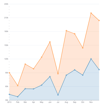
Area Chart
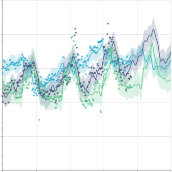
The Area Chart is perfect for visualizing trends in sales volume or revenue over time. In a marketplace context, you can use it to track monthly or quarterly sales performance, comparing different product categories or partners.
Use Case: Sales Over Time, displaying the cumulative sales of different marketplace products or offers over time to understand seasonality or growth pattern.
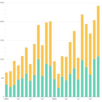
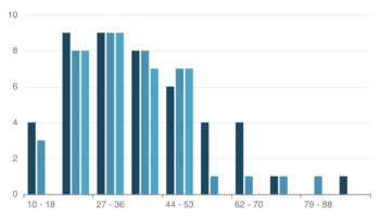
Bar Chart
The Bar Chart is useful for comparing sales data across different categories or products. It allows you to quickly identify top-performing items and underperforming ones.
Use Case: Sales by Product/Category, comparing the sales volume of different marketplace products, cloud partners (e.g., AWS, Azure, GCP), or sales regions.
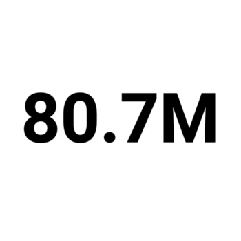
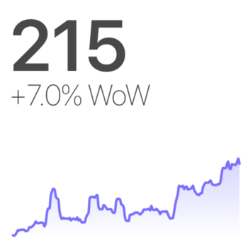
Big Number
This chart is ideal for showcasing a single, significant metric. You can highlight the total revenue or sales for a specific time period or other vital KPIs.
Use Case: Key Marketplace Metrics, display the total marketplace revenue for a given month or the number of new marketplace entitlements sold.
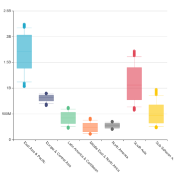
Box Plot
A Box Plot is a statistical visualization used to display the distribution of a dataset, including key summary statistics like the median, quartiles, and outliers. It’s particularly useful for understanding the spread and variation in data.
Use Case: Sales Volume Across Different Partners, in a marketplace where multiple partners (AWS, Azure, GCP) are selling products, a Box Plot can help you understand if the sales volume is consistent across partners or if some have periods of exceptionally high or low sales.
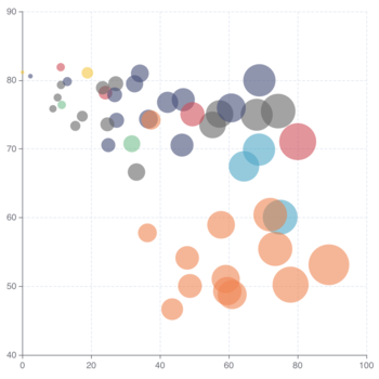
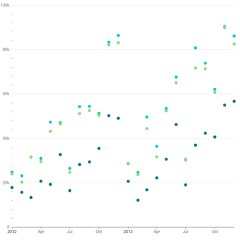
Bubble Chart
A Bubble Chart is a type of chart that uses bubbles to represent data points on a 2D plane. Each bubble’s position on the chart represents two variables, and its size represents a third variable. This allows you to visualize three dimensions of data at once.
A Bubble Chart is particularly useful when you want to visualize relationships between three variables (for example, sales performance, number of units sold, and customer engagement) in a marketplace setting.
Use Case: Sales by Product,
- X-axis: Represents the total units sold.
- Y-axis: Represents the average order value (or revenue per order).
- Bubble Size: Represents the total sales revenue for that product.
- Bubble Color: Represents different product categories (e.g., electronics, clothing, etc.).
Bullet Chart
Helps measure performance against a target, often used to compare actual sales to projected or goal figures.
Use Case: Performance Against Goals, show how monthly sales are tracking against a set sales target for the marketplace.
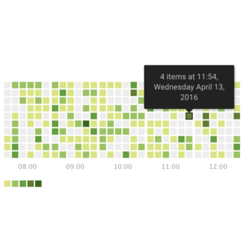
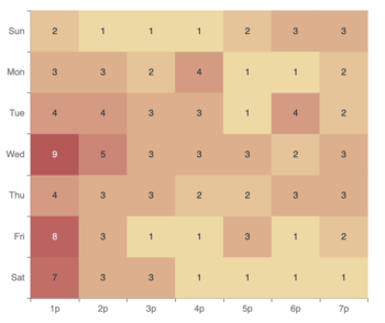
Calendar Heatmap
Shows daily sales activity on a calendar grid, with color coding to indicate activity levels.
Use Case: Sales Activity by Date, visualize daily sales trends for a specific marketplace product or offer.
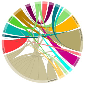
Chord Diagram
Displays relationships between different entities.
Use Case: Interconnections Between Entities, visualize how sales in different marketplace product categories connect to partner sales reps or buyers.
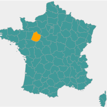
Country Map
Provides a map view showing sales in different countries.
Use Case: Global Sales Distribution, track sales performance in various countries where the marketplace operates.
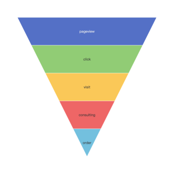
Funnel Chart
A Funnel Chart is well-suited for visualizing the conversion rate of users or leads through a sales process. In marketplace sales, this could represent how many users progress through stages like product views, cart additions, checkout, and purchases.
Use Case: Sales Conversion Process, tracking the sales funnel from initial product views to completed purchases in the marketplace, showing where potential customers drop off.
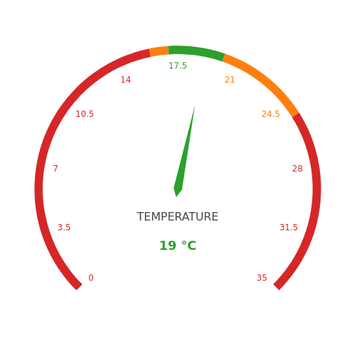
Gauge Chart
Tracks performance against a goal, similar to a speedometer.
Use Case: Progress Monitoring, monitor current marketplace revenue against a set target.
Generic Chart
A more flexible chart type for custom data representations.
Use Case: Customizable Visualizations, can be used to create tailored visualizations specific to the marketplace’s needs.
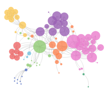
Graph Chart
Represents relationships between entities, like users, products, or partners, in a network format.
Use Case: Network Analysis, visualize the relationships between marketplace products and cosell partners.
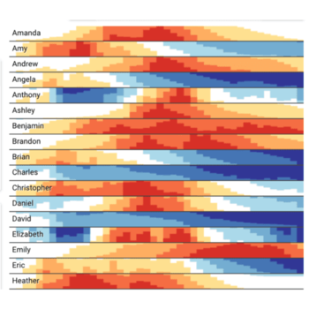
Heatmap
The Heatmap chart is effective for showing sales activity across different time intervals, such as days, weeks, or months. It highlights when sales are peaking and can identify patterns in customer behavior or sales cycles.
Use Case: Sales Activity by Time, visualizing sales activity by day and time, helping you identify the most profitable days or hours for sales in the marketplace.
Histogram
A Histogram helps you understand the distribution of sales, whether it’s the number of units sold per product or the price range of items purchased.
Use Case: Sales Distribution, displaying the distribution of average order value or the number of items sold within specific price ranges.
Horizon Chart
Similar to line charts but with color bands to indicate magnitude.
Use Case: Trends Over Time, track changes in total marketplace revenue over time.
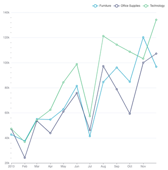
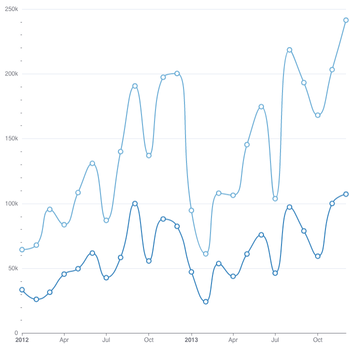
Line Chart
The Line Chart is great for showing continuous trends, such as daily, weekly, or monthly sales figures. It’s perfect for tracking sales growth and forecasting future trends.
Use Case: Sales Trends Over Time, tracking marketplace sales growth over time and comparing performance across different products or regions.
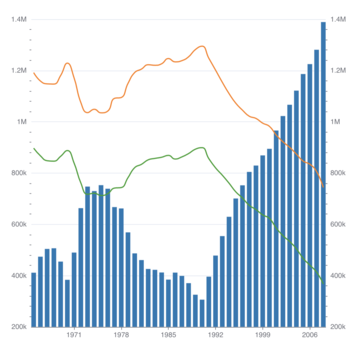
Mixed Chart
Combines two chart types into one visualization for comparison.
Use Case: Combining Multiple Chart Types, compare sales volume alongside customer ratings using a mix of line and bar charts.
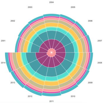
Nightingale Rose Chart
A variant of the radar chart, useful for comparing categories around a central point.
Use Case: Comparing Categories, compare sales performance of marketplace products based on different metrics.
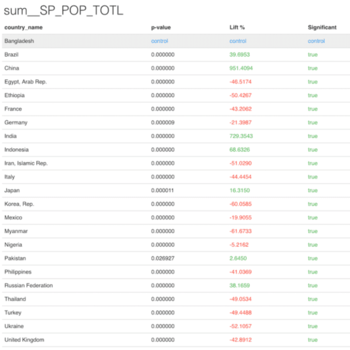
Paired t-test Table
Used for statistical analysis of two sets of data to see if there’s a significant difference.
Use Case: Statistical Comparison, compare sales before and after a promotional campaign in the marketplace.
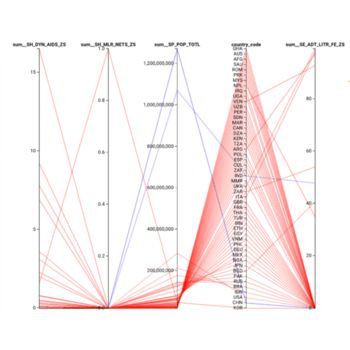
Parallel Coordinates
Visualizes data with multiple variables in parallel axes.
Use Case: Multivariate Data Analysis, compare product sales, revenue, and user engagement across several products.
Partition Chart
Visualizes hierarchical data in a tree-like structure.
Use Case: Hierarchical Data Representation, visualize how marketplace sales are distributed across different product categories and subcategories.
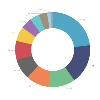
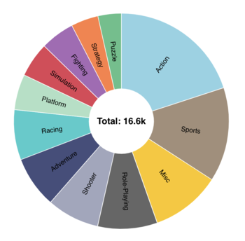
Pie Chart
The Pie Chart is useful for visualizing the relative share of marketplace sales across different categories or products.
Use Case: Sales Distribution, showing the percentage of sales generated by different product categories (e.g., software, hardware) or cloud partners (AWS, Azure, GCP).
Pivot Table
Summarizes large datasets, allowing quick exploration of key metrics.
Use Case: Data Summarization, used to summarize sales data by region, product, or partner.
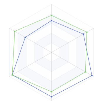
Radar Chart
The Radar Chart is useful for comparing multiple variables at once. In the marketplace, it can show how different sales metrics (e.g., revenue, customer satisfaction, inventory levels) perform across different products or categories.
Use Case: Comparing Marketplace Metrics, comparing the sales performance of different marketplace products on multiple dimensions, such as revenue, customer ratings, and return rates.
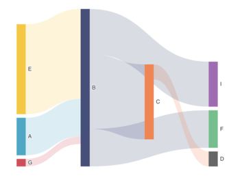
Sankey Chart
A Sankey Chart visualizes the flow of data, making it ideal for understanding how marketplace sales revenues are distributed across different sources or stages.
Use Case: Sales Flow Analysis, visualizing how revenue flows from product categories to individual sales reps, or how sales are split between marketplace offers (e.g., discounted vs. regular priced).
Scatter Plot
The Scatter Plot is helpful for visualizing the relationship between two variables, such as sales volume and customer engagement.
Use Case: Sales by Product vs. Customer Engagement, plotting sales volume on the x-axis and customer satisfaction scores on the y-axis to see if there’s a correlation between product popularity and customer ratings.
Smooth Line
Similar to a line chart, but with a smoothed curve to make trends easier to spot.
Use Case: Trend Analysis, track the trend of marketplace revenue while filtering out short-term fluctuations.
Stepped Line
Shows trends in a stepped format, useful for data that changes at discrete intervals.
Use Case: Discrete Trends, track sales changes at different time intervals in the marketplace.
Sunburst Chart
Visualizes hierarchical data in a circular structure.
Use Case: Hierarchical Data Exploration, show sales breakdown by product category and subcategories.
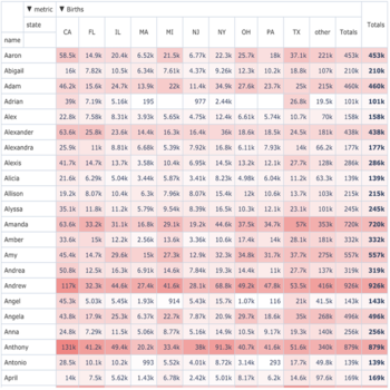
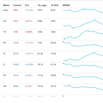
Time-series Table
A Time-series Table displays data over time in a tabular format, allowing users to track the changes in metrics such as revenue, units sold, customer acquisition, and other key performance indicators (KPIs) over specified time intervals.
Tree Chart
The Tree Chart is effective for visualizing hierarchical data, such as sales across multiple levels of a product hierarchy.
Use Case: Hierarchical Sales Data, visualizing how sales are distributed across product categories, subcategories, and individual items within the marketplace.
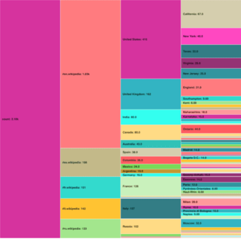
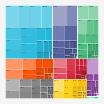
Treemap
A Treemap displays hierarchical data in nested rectangles, ideal for showing how marketplace sales are distributed across various product categories or sales regions.
Use Case: Sales Hierarchy by Product/Category, a treemap can show the proportion of total sales made by different marketplace product categories (e.g., software, services) or by cloud partners (AWS, GCP, Azure).
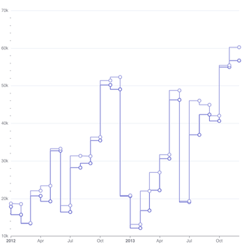
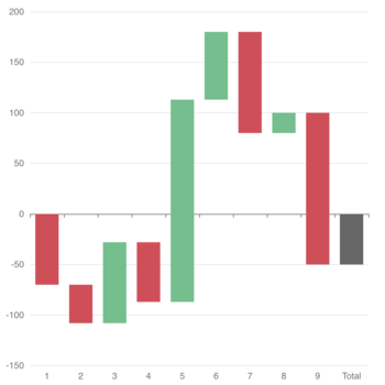
Waterfall Chart
The Waterfall Chart is excellent for visualizing the incremental change in sales or revenue over time or across different business units.
Use Case: Revenue Change Analysis, visualizing how revenue changes month-over-month, showing how new product launches or seasonal promotions contribute to overall sales.
Word Cloud
The Word Cloud helps analyze customer feedback and reviews by visualizing the most frequently mentioned keywords or phrases.
Use Case: Customer Feedback Analysis, creating a word cloud from customer reviews of marketplace products to identify common themes, such as satisfaction with features or concerns with usability.

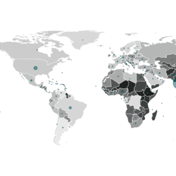
World Map
A World Map is a type of visualization that represents geographical data using a map of the world. It is particularly useful for displaying metrics that vary across different regions or countries, such as sales performance, customer acquisition, or market share.
Use Case: Global Sales Distribution, This helps you quickly identify the top-performing countries or regions and those that are underperforming.
- Metric: Total sales revenue from each country or region.
- Visualization: Countries are color-coded based on total revenue (e.g., red for high revenue, blue for low revenue).