
Reading Your Usage
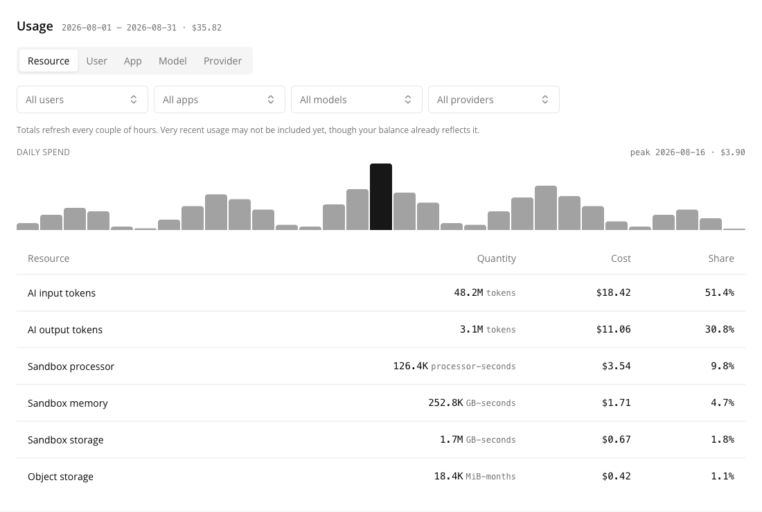
The Usage panel sits below the summary on Settings → Billing. It answers one question — what is costing this much — by re-pivoting the same period across the attributes Suger records as consumption happens.
Choose the month
The period selector at the top of the page drives both panels, so the summary and the usage table always describe the same month. It offers the last 12 months, newest first, with the current month marked (current).
Selecting a closed month shows that month’s settled figures. The credit balance above is always your balance now.
Group the period
The tab strip re-pivots the same consumption. Every pivot totals the same amount.
| Group by | Answers |
|---|---|
| Resource | What kind of thing did the money go on — tokens, sandbox, storage |
| User | Which member of the organization caused it |
| App | Which Insulin app it ran under |
| Model | Which model was used |
| Provider | Which provider served it |
Each row shows a quantity, the cost, and the row’s share of the period. The unit is named only in the Resource grouping: every other grouping mixes resources measured in different units — tokens with processor-seconds — so a single unit label would be wrong.
Rows with nothing to attribute
Some consumption genuinely has no value for the dimension you picked: a scheduled job has no user, a direct API call has no app, sandbox storage has no model. Those rows are named rather than dropped —
| Grouping | The unattributed row reads |
|---|---|
| User | No user — scheduled and system runs |
| App | No app |
| Model | No model — sandbox and storage |
| Provider | No provider — sandbox and storage |
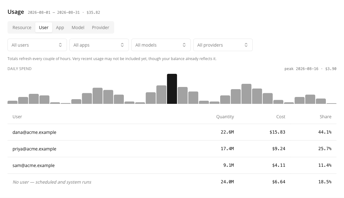
This is why the pivots reconcile. If unattributed consumption were left out, the by-user view would quietly total less than the by-resource view, and neither would match your bill.
Narrow it with filters
Four multi-select filters — users, apps, models, providers — sit under the tabs. Grouping and filtering answer different questions: grouping is what did we spend it on, filtering is what did this team spend it on.
A filter’s choices come from the grouping currently shown, so the filter matching the active tab is the one with values to pick. To narrow by user, switch to the User grouping first and the Users filter fills with the people who actually used AI this period; the selection then stays applied as you switch to another grouping. This is also why no filter ever offers someone who never used AI — the list is built from the period’s own results, not from your member list.
With any filter applied the panel says so, because a filtered total is a subset of the period, not the whole bill. Clear filters returns to the full period.
The daily spend chart
One bar per day of the period, with the peak day highlighted and labelled above the chart. Days with no spend render as an empty slot rather than being closed up — a chart that bridged a quiet weekend would draw a slope across spending nobody can account for.
Why the table can look emptier than your balance
The usage breakdown is re-aggregated every couple of hours. The credit balance above it comes straight from the ledger and moves within about a minute of a request.
So this sequence is normal:
- You run something expensive.
- The Credit balance drops immediately.
- The Usage table still shows the period without it.
The panel says as much above the table. If the two disagree, the balance is the current one — the table is catching up, and nothing has been lost or double-counted.
An empty table therefore means nothing has been aggregated for this period yet, which is not the same as you have used nothing.
What this panel does not do
There is no CSV export and no per-request drill-down. The finest grain available here is a grouped row for the period. If you need the underlying detail — to reconcile a specific job or a specific day — contact support@suger.io while the consumption records are still inside their 90-day retention window.
Spotted something wrong or out of date on this page? Tell us and we'll correct it.